2024 Colors of the Year!
The start of the new year often brings inspiration to refresh and update our homes. A simple color change can make dull or outdated spaces look and feel new.
Every year, paint manufacturers and designers announce the trends and colors for the following year. For 2024, the trend in colors evokes feelings of calm and bliss.
Onward and Upward with Sherwin-Williams
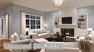
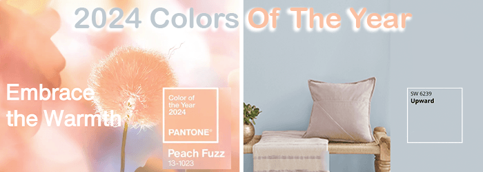
Sherwin-Williams explores in their annual Colormix® Forecast the rising influences and movements shaping tomorrow’s designs through a curated collection of color. Their color of the year is Upward SW 6239.
Described as denim blue with calm gray undertones, this breezy, blissful blue helps us slow down, take a breath, and allow the mind to clear. It will have you “dreamily adrift in the stratosphere.”
They suggest pairing this light neutral with a cool pastel or dark, earthy tones to complete the effect with these colors:
- Icicle SW 6238
- Extra White SW 7006
- Neutral Linen SW 9109
- Snowbound SW 7004
- Drift of Mist SW 9166
- Gale Force SW 7605
- Tricorn Black SW 6258
- Honeydew SW 6428
- Palm Leaf SW 7735
- Antiquarian Brown SW 0045
A New Approach to Color
Sherwin-Williams recently released Anthology, their biennial color trend report. In it, you will find shifts within four key chromatic families. Discover the lines where blue meets green, the softness and splendor of reds and purples, the solace of deep and dark tones, and the delicate touch of whites and tints.
“These color trends are poised to play a significant role in tomorrow’s designs. From blues and greens to delicate tints, the leading shades of Anthology: Volume One are setting the color direction as we move into a new era of trend reporting,” says Sue Wadden, Sherwin-Williams Director of Color Marketing.
Explore Sherwin-William’s 2024 Colormix® Forecast.
Explore the 2024 Color Trend Report
Life Is Peachy
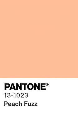
Pantone’s 2024 Color of the Year, Peach Fuzz 13-1023, is the shade as a “crimson red tone that presents a balance between warm and cool.”
Pantone is not a paint manufacturer. You can’t go the hardware store and buy Pantone paint. Pantone is the standard language for color communication from designer to manufacturer to retailer to customer. That means that the people at Pantone collaborate with graphic, fashion, textile, and interior designers to create new inspiring colors.
The process is called Pantone Matching System (PMS). When a color is created, it is given a name and a number. The associated number is its PMS number and is the code for how the color was created. It is basically the recipe that is needed to make the color. You can find number on Pantone website. The green and pink chart is two examples of PMS “recipes.” It may not mean anything to the homeowner, but the paint store needs those numbers to mix a batch of paint to match the desired color. You don’t need to provide the recipe, just give them the PMS number. They will have the rest of the information.
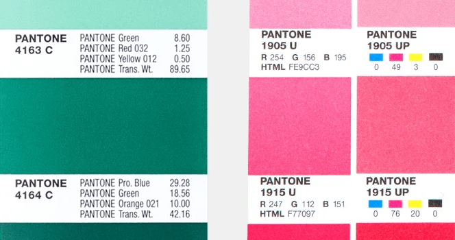
Pantone produces several guides every year containing thousands of solid PMS colors on coated and uncoated chips with corresponding printing ink formulas for each color. The guide refers to each PMS color by its allocated number. Peach Fuzz, for instance, is PMS 13-1023.
Of the new colors created, one color is selected for the Color of the Year.
And that brings us back to Pantone Peach Fuzz 13-1023. It is a velvety, gentle peach tone whose all-embracing spirit enriches mind, body, and soul.
“In seeking a hue that echoes our innate yearning for closeness and connection, we chose a color radiant with warmth and modern elegance. A shade that resonates with compassion, offers a tactile embrace, and effortlessly bridges the youthful with the timeless,” says Leatrice Eiseman, Executive Director, Pantone Color Institute™.
Pantone’s concept of Peach Fuzz in home interiors is to create a welcoming ambiance.
“Promoting feelings of gentle warmth whether appearing on a painted wall, in home décor or acting as an accent within a pattern, Pantone 13-1023 Peach Fuzz infuses our most personalized worlds with a comforting presence,” says Pantone.
Same Names. Different Colors
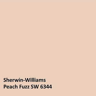
Sherwin-Williams offers a color called Peach Fuzz SW 6344 in their orange family pallet. They suggest pairing it with Alluring White SW 6343, White Flour SW 7102, and Copper Wire SW 7707. You may want to use it with their Color of the Year, Upward SW 6239.
As you can see from the color swatches, despite the name, the color is not the same. Each paint manufacturer creates their own colors and names. It can be a little confusing. If you want Pantone’s Peach Fuzz to be made by Sherwin-Williams, you need to provide the PMS number as previously explained.
Incorporating New Colors
Rochelle Horn, CKBD, CLIPP, Sales Consultant and Designer, Rosie Right | Design. Build. Remodel., a Rosie on the House Certified Partner, notes, “Color makes a huge difference in how we view our space,” she says. “I often suggest, especially if the clients are nervous about it, incorporating color using paint or accessories instead of cabinetry, countertops, etc., which are easier to change and less expensive. Other clients want to be fully immersed in their favorite color like a dramatic range and hood in blue or red.”
She also sees these colors being implemented in today’s trends: “The most popular cabinet colors are white, blue, black, and green, although wood tones are still strong, and blending is common,” she says.
Rochelle cautions, “Try before you buy!”. That’s where utilizing paint samples comes in.
Whether you select Sherwin-Williams Color of the Year, or colors in the Pantone spectrum, don’t buy cans of paint without knowing how the colors will look in your home. Sherwin-Williams offers plenty of sample options:
- Color to Go® paint samples are great for seeing how a color looks and feels in your space throughout the day. Each sample comes in a Twist-n-Pour container with enough paint to create test swatches so you can choose your final color with confidence.
- Peel & Stick repositionable 8” x 8” samples allow you to see how your color favorites look throughout the room.
- Color chips are available in all colors and will help narrow your choices. Receive up to 10 chips for free.
- Order color samples.
- ColorSnap® Visualizer is a mobile app that allows you to see how a color looks in a whole room. Their newest version of ColorSnap® Visualizer for mobile integrates a cutting-edge augmented reality (AR) experience called Instant Paint. This feature provides a fast, seamless way to visualize any of their 1,700 colors on walls—in real time. Easily create custom palettes, save colors, try different color options and share results in a variety of ways. Trust us, it’s really cool.
Implement Colors Without Painting
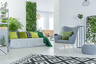
You can inexpensively incorporate your desired colors without painting. Changing throw pillows and blankets takes a lot less effort. If you like the paint color in a room, why change it just to be trendy?
As exciting as new colors can be, Rochelle says, “I find it’s so important to listen to the client. Do they want trendy or classic? Is this their forever home?”
There is a lot to consider when changing colors. You can go big with new paint or scatter accessories for pops of color.
Whatever you decide, before starting any painting project, whether it be a DIY job or one that you hire a professional to do, be sure to read Rosie’s Painting Consumer Guide. There you will find instructions about the types of paint needed for specific jobs to hiring a contractor.
###
PODCAST
A new year often brings inspiration to refresh and update our homes. A simple color change can make dull or outdated spaces look and feel new. Sherwin Williams’ Senior Designer Account Executive Laurie Clark talks about how Color Marketing Group determines color trends, the Sherwin Williams color of the year called Upward and tools you can use to help find the right colors for your project.
Podcast Archive With Expanded Content and Resources
PHOTO CREDIT
- Sherwin Williams
- Pantone

